dot.
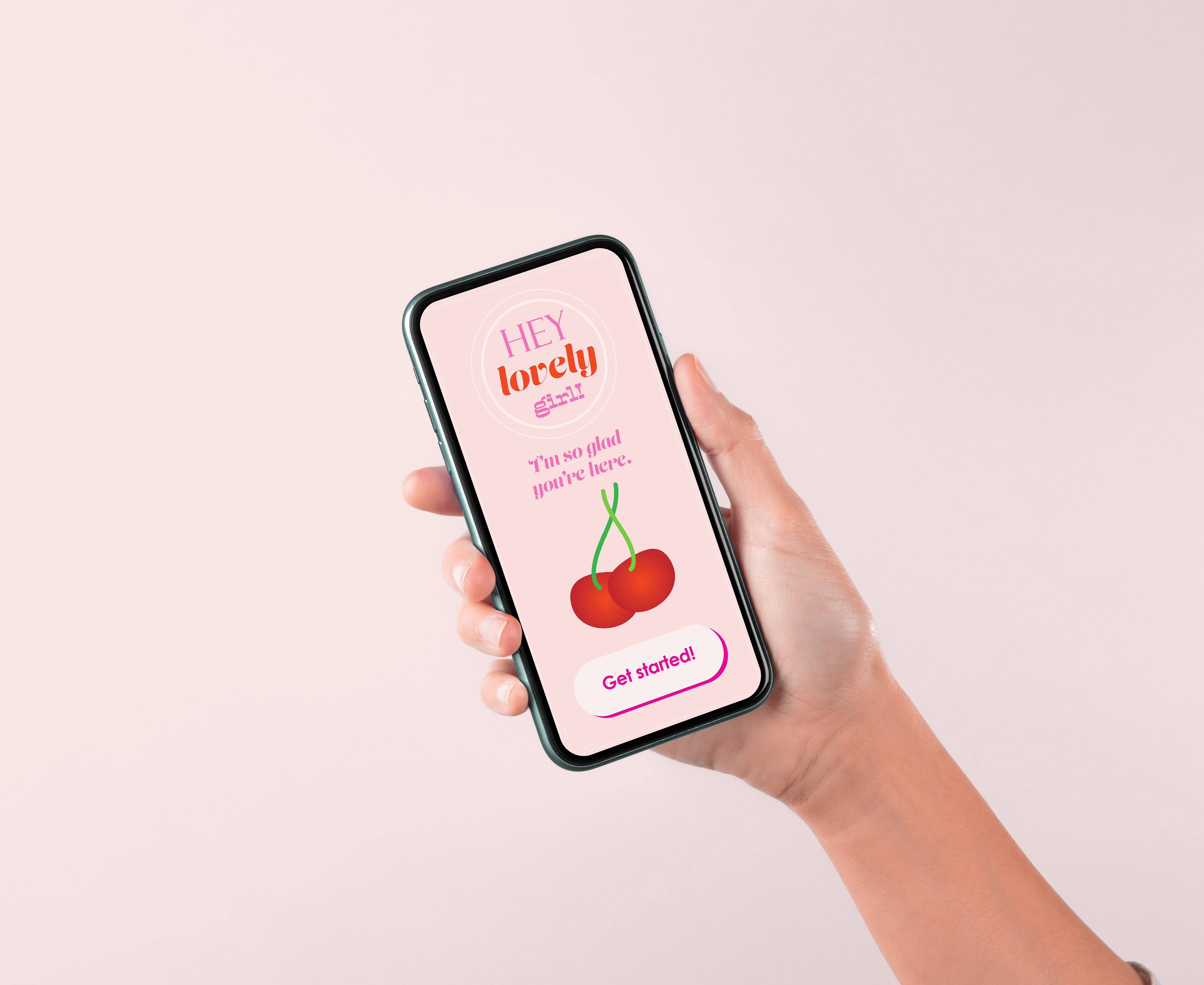
Born during my time as a Brand Expressions Design Co-op at Procter & Gamble, dot. is a guided self-care app for tween girls going through puberty. Driven by my passion to help tween girls during difficult times, this app uses friendly visuals and interactions to guide tweens in an innovative way.
Branding, Storytelling, UX/UI
Figma, Mural, Illustrator, Photoshop
Branding, Storytelling, UX/UI
Figma, Mural, Illustrator, Photoshop
Background
At P&G, I learned the importance of recognizing consumers who need help, then designing for them. After reflecting on my own life, I found one area that could have used better design solutions was navigating my tween years and better understanding puberty.
At P&G, I learned the importance of recognizing consumers who need help, then designing for them. After reflecting on my own life, I found one area that could have used better design solutions was navigating my tween years and better understanding puberty.
Research
Audit current tween resources and trends. Organized data and discoveries using Mural to allow for interactive brainstorming and easy visualization of the market.
Audit current tween resources and trends. Organized data and discoveries using Mural to allow for interactive brainstorming and easy visualization of the market.


Form Testing
Tested multiple forms for the product including an app, starter kit, and a social movement campaign to understand how they could benefit the consumer. Studies showed the app could be the most beneficial form for the content, with hopes that it could eventually build into a kit and movement.
Tested multiple forms for the product including an app, starter kit, and a social movement campaign to understand how they could benefit the consumer. Studies showed the app could be the most beneficial form for the content, with hopes that it could eventually build into a kit and movement.
Deep Dive
Conducted extensive research on Generation Alpha, tween trend reports, and gameplay design criteria in order to reach the consumer effectively through an app interface.
Conducted extensive research on Generation Alpha, tween trend reports, and gameplay design criteria in order to reach the consumer effectively through an app interface.
Information Architecture
Low-fidelity wireframes designed to map out the flow and screens needed.
Low-fidelity wireframes designed to map out the flow and screens needed.
Learn
Users are required to learn about how to care for their body and the changes that come with it in order to level up and earn coins.
Users are required to learn about how to care for their body and the changes that come with it in order to level up and earn coins.
Play
Provides tweens with encouragement and ideas to spend more time outside and off the screen.
Provides tweens with encouragement and ideas to spend more time outside and off the screen.
Care
Tweens are given a safe space to reflect on their emotions to provide a holistic approach to self-care.
Tweens are given a safe space to reflect on their emotions to provide a holistic approach to self-care.